My talented and beautiful wife is the chairperson of Stir, an upcoming design symposium at The Ohio State University. From their about page:
The Stir Symposium seeks to provide an opportunity to collaborate, think, and discover new ways to approach big global issues. Participants from many disciplines will bring their own expertise to the table, thereby allowing us all to start addressing problems and issues in ways we never would have thought of on our own. The Stir Symposium is about collaborating and thinking in new ways, no matter the discipline: business, architecture, engineering, design, agriculture, geography, and more.
Interesting, right? I’ve been fascinated by this upcoming symposium since the beginning, and I was hoping there would be a way I could get involved. Then I found about the role of Visualizer. It seems that each Stir session (workshops and discussions) will contain a Visualizer who will summarize and visualize the process and outcomes of that session. Unsurprisingly, I was in no way allowed to simply waltz in as a Visualizer. I had to apply like everyone else and so I did.
The following images represent my application (click to embiggen).
They wanted to be sure each Visualizer had the ability to come up with quick and attractive infographics, so the first image requested was an infographic covering a specific Stir theme. I chose the theme “Moving: taking public transportation to work”.

They also asked for a portfolio of 3-5 pieces.
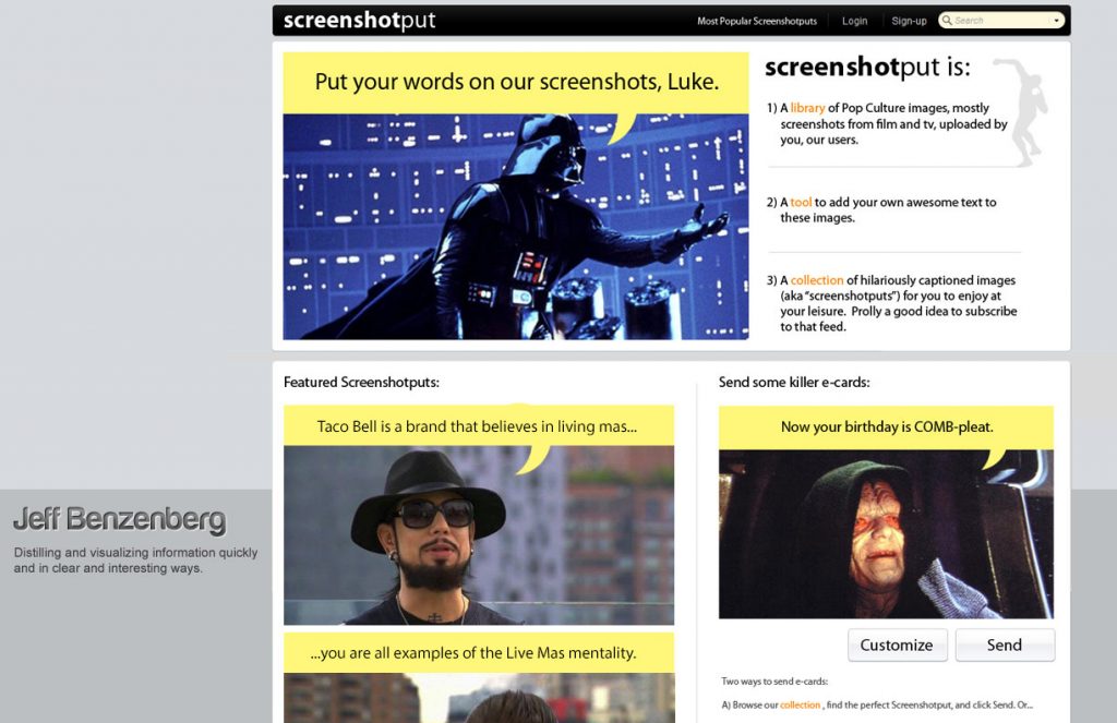
This first image is a mockup of a website I’d been tossing around in my head. It’s called Screenshotput, and it’s a huge library of images from pop culture, mainly screenshots from film and tv, and it is also a tool that lets users put their own text on these images. I created this mockup a couple years ago, before comixed gained much traction, and before the Rage Face generators and Quickmeme even existed. I still think comixed has a lot of room for improvement, so perhaps there is still opportunity in the world for a site like Screenshotput.
This next image is a mockup I created for a couple friends who are starting a classified ad site for dog breeders. It’s a pretty neat idea: take a classified section that craigslist doesn’t do very well and create a niche site dedicated to it. They could certainly expand past dogs quickly. Not sure when this will launch.

These final two images are from websites I have designed. If you dig them, check out my posts on Customized Girl and Follow Function. (This is the “custom t-shirt” landing page on Customized Girl).